Exploring Covid 19 data - Part 2
In another post we stated the problem and now we’ll show - high level - how we actually collected the data through R and how we created a DataViz using ggplot2. The code is hosted on a public repository on GitHub.
The data concerns about confirmed or suspected deaths caused by Covid-19 in Brazil and it’s provided by Brazilian Civil Registry Offices. We saw that the data is disaggregated by states, gender and age group in a JSON format in this link ‘https://transparencia.registrocivil.org.br/api/covid?data_type=data_ocorrido&start_date=2020-01-01&end_date=2020-04-26&state=Todos&search=death-covid&groupBy=gender’, like this:
{"chart":{"< 9":{"F":7},"10 - 19":{"M":24,"F":19},"20 - 29":{"F":31,"M":37},"30 - 39":{"M":116,"F":66},"40 - 49":{"F":132,"M":246},"50 - 59":{"M":364,"F":203},"60 - 69":{"M":604,"F":357},"70 - 79":{"M":672,"F":422},"80 - 89":{"F":416,"M":436},"90 - 99":{"M":123,"F":176},"> 100":{"M":5,"F":9}},"created_at":"26\/04\/2020 16:00"}
To read the data we use the function fromJSON() from the package jsonlite, passing as a parameter the url. In order to do this we create a function so we can go through each state in a daily basis:
url_function <- function(state, start_date, end_date) {
  paste0("https://transparencia.registrocivil.org.br/api/covid?data_type=data_ocorrido&search=death-covid&state=",
         state,
         "&start_date=",
         start_date,
         "&end_date=",
         end_date,
         "&groupBy=gender")
}
The output from a request to the website looks like this:
url <- "https://transparencia.registrocivil.org.br/api/covid?data_type=data_ocorrido&search=death-covid&state=BA&start_date=2020-01-01&end_date=2020-04-23&groupBy=gender"

data <- jsonlite::fromJSON(url)

glimpse(data)
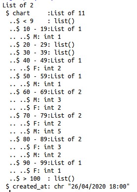
There is an excellent post that explains how to parse data in JSON format using the function unnest() from purrr package, in a more ‘tidy way’. We didn’t have success using this approach, so tried another way: the output from the request is an object of type list and we can get into it’s elements using brackets, in a more ‘base R’ way. Another detail is that the age groups are in the names of this list, so we have to use the function names() to extract it.
This how the data gathered look like after the cleaning process:
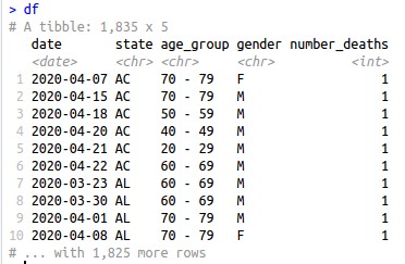
The dataset is in .csv and is available for download. It was collected in 26/04/2020 and points to 4,475 deaths caused or suspected to be caused by Covid-19 in Brazil from 16/03/2020 to 26/04/2020.
We want to do a pyramid chart faceted by the states and in a chronological approach. In order to do that we need a dataset with every possible combination of the attributes we want to use, in our case is: state, gender, age group and date. In addition, we want the pyramid to show cumulative cases.
To create this ‘all combinations’ data frame we used the function cross_df() from purrr package, and passed as parameters all the attributes in a list format. This link was useful for details of the function. Once we have that data frame we use r left_join to get the number of deaths in each day, the resulting NA’s represents 0 deaths:
df_pyramid_all <- purrr::cross_df(
  .l = list(
    "state" = df %>% select(state) %>% unique() %>% pull(),
    "date" = df %>% select(date) %>% unique() %>% pull(),
    "gender" = df %>% select(gender) %>% unique() %>% pull(),
    "age_group" = df %>% select(age_group) %>% unique() %>% pull())
  )

df_pyramid_all <- df_pyramid_all %>%
  mutate(date = lubridate::as_date(date))

df_pyramid_all <- df_pyramid_all %>%
  left_join(df, by = c("state", "date", "age_group", "gender")) %>%
  mutate(number_deaths = ifelse(is.na(number_deaths), 0, number_deaths))
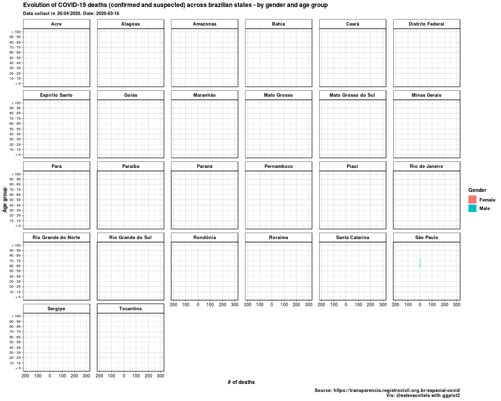
Finally, using gganimate we were able to generate the plot, that is a .gif actually. The package renders the plot in a gif or a video and it takes some time to do that, and it’s documentation clearly explains how to.
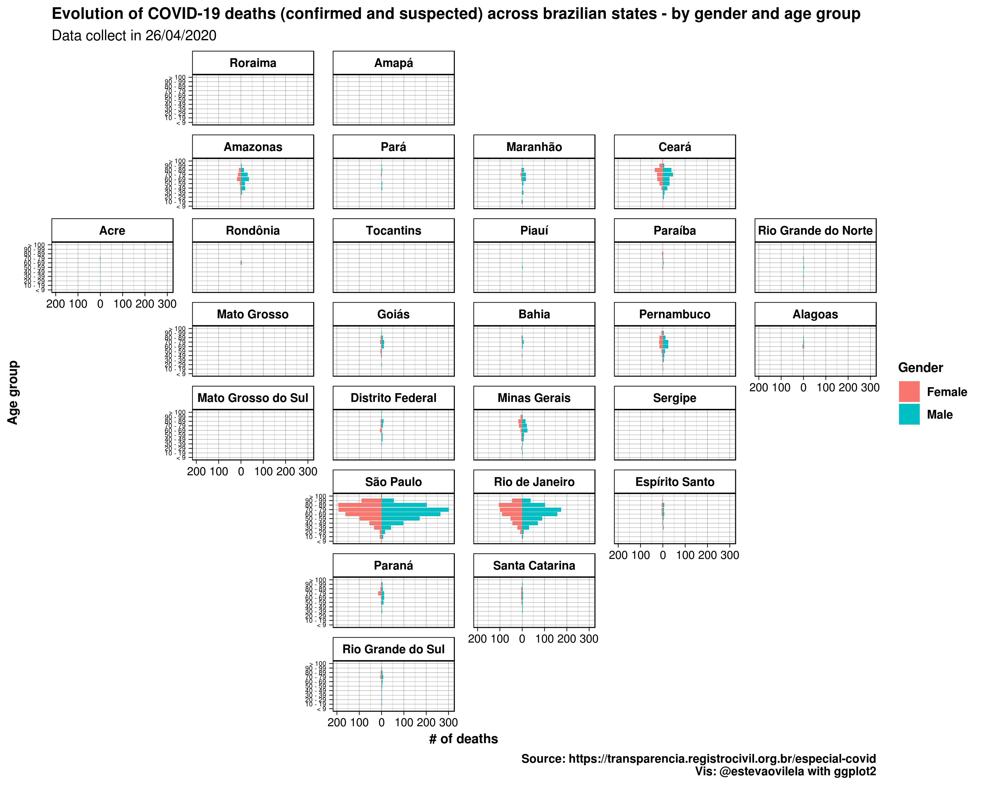
This is the DataViz:
Would like to thank Eva Maerey for her flipbook on more details about themes in ggplot2.
At first intended to make two plots, one with the pyramid chart and another with a map. Then, discovered an excellent function watching Alex Engler presentation “Better DataViz in ggplot2: Tips, Tricks & Examples” in 2019 DC R Conference: facet_geo from geofacet package (at 18:00, but the whole video is recommended):
This function allows to facet the data in a geographically way like a choropleth map, but instead of coloring some polygon data, it arranges our facetted graph and position each of the polygon in it’s geographical ‘location’. It has several possible grids, you can take a look using r geofacet::get_grid_names(), we used ‘br_states_grid1’, and can even create your own grid. The result combining facet_geo with gganimate wasn’t that good, but with only one frame it looks like this: